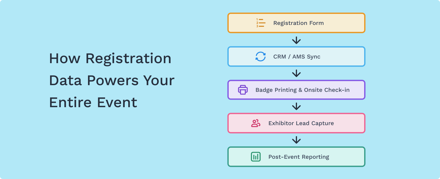
For registration managers at associations and trade show organizations, the registration form is more than just a sign-up page—it’s the operational foundation of your event.
Every field you include (or remove) affects:
- Registration conversion rates
- Data cleanliness for CRM or AMS systems
- Badge printing accuracy
- Attendee segmentation for exhibitors and sponsors
- Post-event reporting
The challenge is finding the right balance: collecting the information your team needs without creating friction that causes attendees to abandon the form.
In this guide, we’ll walk through event registration form best practices to help you design a registration experience that captures clean data while keeping the process smooth for attendees.
Why Registration Form Design Matters More Than You Think
Registration is the first operational touchpoint in the attendee journey.
Poor form design can create issues long before your event begins:
- Duplicate attendee records
- Inconsistent company names
- Missing badge information
- Difficult data exports for sponsors or exhibitors
- Registration abandonment due to long forms
When registration managers structure their forms strategically, they reduce manual cleanup later and ensure the data collected during registration supports the entire event lifecycle.
How Many Questions Should a Registration Form Include?
One of the most common questions event organizers ask is:
How much information should we collect during registration?
Ask too many questions and you increase friction.
Ask too few and your team may spend hours fixing incomplete records later.
A good rule of thumb is to collect only the information required to operate the event successfully.
Information You Should Collect During Registration
Most events need the following information upfront:
Essential attendee information
- First name and last name
- Email address
- Company or organization
- Job title
Operational event data
- Ticket type or registration category
- Badge name or credentials
- Dietary restrictions or accessibility needs
Segmentation fields
- Industry
- Attendee role
- Areas of interest
These fields help organizers structure attendee lists, segment audiences, and prepare accurate badge printing.
What Questions Should You Ask Later?
Not all attendee information needs to be collected during the registration process.
Adding too many fields upfront increases form abandonment.
Instead, consider collecting additional profile information after registration through:
- Attendee profile completion
- Event app onboarding
- Pre-event surveys
Information often better collected later includes:
- Networking preferences
- Detailed interests
- Marketing preferences
- Social media links
This keeps the initial registration experience fast while still allowing you to build richer attendee profiles.
Design Your Registration Form for Clean Event Data
One of the biggest sources of operational stress for registration teams is messy attendee data.
Poorly structured forms often lead to:
- Multiple versions of the same company name
- Duplicate attendee records
- Inconsistent badge formatting
- Complicated exports for sponsors or exhibitors
To prevent this, design your registration form with data consistency in mind.
.png)
Best Practices for Cleaner Registration Data
Use dropdown menus when possible
Dropdown fields prevent inconsistent entries for industries, attendee roles, or company size.
Separate name fields
Use individual fields for:
- First name
- Last name
- Badge name
This ensures badge printing is accurate.
Limit open-text fields
Free-text responses create inconsistent data that can complicate reporting.
Use conditional logic
Only show relevant questions based on ticket type or attendee category.
For example:
- Exhibitors may need booth information
- Speakers may require biography details
- Attendees may not need these fields
Conditional logic keeps forms shorter and more relevant.
How to Reduce Registration Abandonment
Even well-designed forms can cause drop-off if they feel long or confusing.
A few simple design choices can dramatically improve completion rates.
1. Break Long Forms into Multiple Steps
Multi-step forms reduce the feeling of complexity and make the process easier to follow.
Instead of one long page, structure your registration into stages like:
- Contact information
- Ticket selection
- Additional details
- Confirmation
2. Use Progress Indicators
Progress bars reassure attendees that the process will only take a few steps.
3. Save Attendee Information When Possible
Returning attendees should not have to re-enter information every year.
Allowing previously saved profiles helps accelerate repeat registrations and improves accuracy.
Why Registration-First Technology Matters for Events
Many event platforms treat registration as an add-on feature.
But for associations and trade show organizers, registration is the operational backbone of the event.
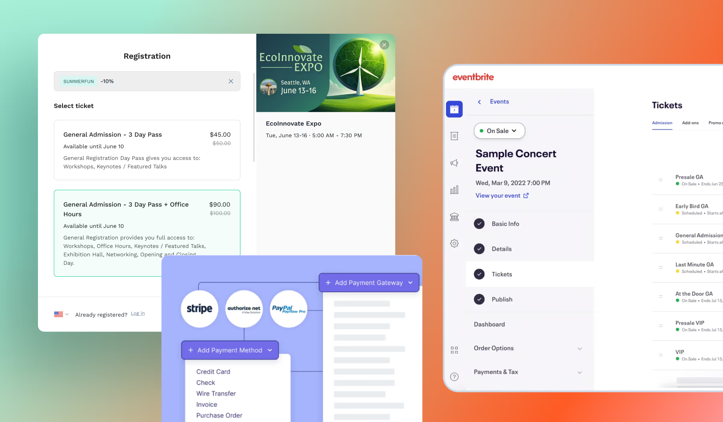
A modern event registration system should support:
- Flexible ticket structures
- Customizable multi-step registration forms
- Conditional logic for different attendee types
- Built-in payment processing
- Clean data exports for CRM or sponsor reporting
- Seamless onsite check-in and badge printing
When registration is built as part of a unified event platform, organizers can manage the entire attendee journey—from registration through engagement and onsite check-in—without stitching together multiple tools.
Learn more about how event registration software can support complex event needs.

Key Takeaways for Registration Managers
Designing an effective event registration form is about balancing data quality and attendee experience.
Remember these best practices:
✔ Collect only the information required to operate the event
✔ Use dropdown fields to improve data consistency
✔ Limit open-text fields when possible
✔ Use conditional logic to keep forms relevant
✔ Break long forms into multiple steps
✔ Collect additional information after registration
When registration forms are structured carefully, organizers can avoid last-minute data cleanup and ensure smoother event operations.
Join 12,000 subscribers and unlock industry secrets.
By submitting this form, you agree to receive periodic emails on insightful content related to events and our product, and in accordance with our Privacy Policy. You can, of course, change your preferences or unsubscribe at any time.


.svg)


.svg)
.svg)
.svg)


